Composition No No’s Part 1 (I’m thinking there will be many parts to this topic!)
Sometimes there’s a great divide between what I know and what I do. And I don’t see my mistakes until later.
In this series of compositional no no’s, I’ll show you how to adjust these paintings simply by cropping the work, or by simply eliminating unnecessary elements.
In other words all of the fixes today will be are subtractive rather than additive.
(Note: These are all digital watercolors from my original photographs using the fun Waterlogue app…check it out!)
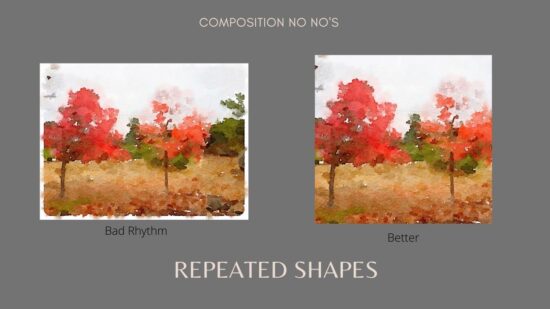
REPEATED SHAPES
Unfortunately I have a tendency to make things nice and even. That makes for an awkward painting. The shapes are still repeated in this new crop but the rhythm is so much better!
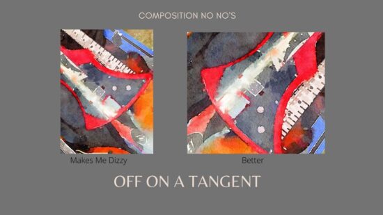
TANGENTS AND MISDIRECTION
Holy cow, I get dizzy looking at this one! And the crops are awkward The one on the right points in in the right direction.
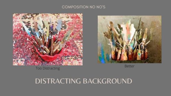
DISTRACTING BACKGROUND
I love red but this is over the top, even for me! I changed the background to something simple so the knives would be the star.
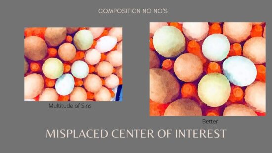
MISPLACED CENTER OF INTEREST
What was I thinking? I completely cropped and rotated this to show only what mattered.
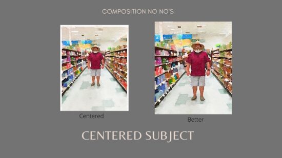
SUBJECT IN THE CENTER
By cropping the right and bottom side ever so slightly, this painting became much stronger.
So there you go. Crop away and if you can’t crop, well, paint over it!
For the latest tips and lessons, please be sure to subscribe to my YouTube channel.
And don’t forget to visit Painterly to get your FREE Mini-Course, A Guide to Painting Knives

